online ordering
online ordering
www.zomato.com
www.zomato.com
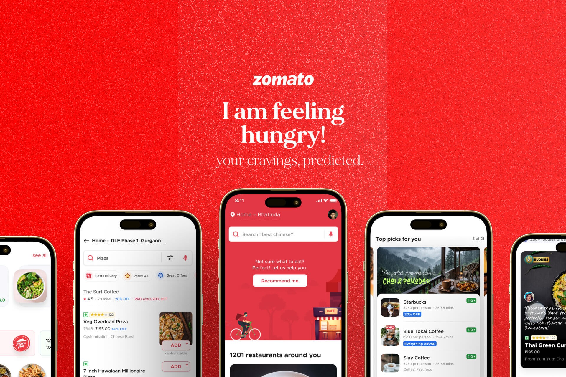
I am feeling hungry.
I am feeling hungry.

Background
Background
Background
Zomato is a leading hyper-local food technology platform operating in a high-velocity, high-volume marketplace. Platform success relies on maximizing checkout conversion rates through tight coordination between customer demand, restaurant preparation, and delivery fleet liquidity.
This case study explores a systemic overhaul designed to combat critical drop-off rates driven by decision fatigue, elegantly nudging customers toward order completion.
Zomato is a leading hyper-local food technology platform operating in a high-velocity, high-volume marketplace. Platform success relies on maximizing checkout conversion rates through tight coordination between customer demand, restaurant preparation, and delivery fleet liquidity.
This case study explores a systemic overhaul designed to combat critical drop-off rates driven by decision fatigue, elegantly nudging customers toward order completion.
Overview
Overview
Overview
We noticed an interesting behavioral pattern on Zomato. Customers would open the app hungry, fall into a 30-minute scrolling maze, look at dozens of options, and then completely close the app. They weren't bouncing because they lacked intent; they were bouncing because they were stuck in an exhausting evaluation dilemma. They wanted to eat, but the sheer volume of choices made deciding feel like a chore.
Fixing this wasn’t a straightforward, linear UX patch. It was a classic convergent research challenge with deeply tangled operational branches—spanning algorithmic relevance, contextual UX, and marketplace liquidity. We couldn't just redesign a filter pill or tweak a single layout; we had to rewrite the underlying recommendation logic, reshape the UI across multiple separate touchpoints, and sync up with multiple teams to incorporate these changes.
Solving decision fatigue meant realizing that "hunger" isn't a singular state—intent is fluid and highly sensitive to external variables. When a customer opens a food delivery app, you are racing against a biological clock. The longer it takes them to resolve their dinner dilemma, the higher their frustration peaks. To help customers navigate their selection hurdles, we mapped the ecosystem broadly and bifurcated our research based on customer intent depth.
High-Intent Customers: Treating Search as an Express Lane
For the one-third of customers who already knew what they wanted, our existing search engine was an obstacle course. They were forced to filter by restaurant brands instead of what they actually wanted to eat. Our goal was to eliminate friction and assist customers in finding exactly what they were craving at that moment.
Dish-First Indexing: Customers crave dishes, not logos. We shifted the visual hierarchy of search results to index heavily around specific food items rather than just restaurant storefronts. If you searched "Biryani," you saw the best biryani recommendations near you immediately, bypassing the step of clicking into individual restaurant menus.
The Relevant Filter: We bucketed critical decision parameters—like "Fastest delivery," "Top Rated," "Trending Nearby," and "Great offers"—and made them more prominent for the customer. No more hunting for boring, tiny filter icons at the top of the screen.
Social Proofing as a Decision Trigger: Generic 4.5-star ratings aren't the only factor when you're starving and undecided. We injected dynamic, high-velocity micro-copy underneath listings (e.g., "1.2k people ordered this specific meal here today"). This leveraged social proofing to instantly validate the choice and accelerate checkouts.
Changing the Order of Rails on the Homepage: Based on intent depth and the time spent on the app in a given session, we dynamically changed the order of content rails on the homepage to assist customers in their selection. For example, we surfaced the "previously ordered" rail at the very top for customers whose average session duration was less than 5 minutes.
Low-Intent Customers: Designing Contextual Triggers
Then we had the explorers. These were the customers trapped in the 30-minute scrolling loop because a generic list of "Restaurants Near You" presented a massive paradox of choice. For them, we didn't want a system that forced them to weigh pros and cons; we wanted the app to elegantly guide them to a decision.
Real-World Environmental Triggers: We plugged our homepage algorithm into hyper-local weather and time APIs. If the system detected it was suddenly pouring rain outside, the main hero banners instantly shifted away from standard listings to comfort food pairings—like a highly visual Chai & Pakoda tray. It resolved the "what should I eat?" dilemma by matching their immediate environment.
Emotional Nostalgia Loops: We took past order data out of the dry history tabs and pulled it directly into the main feed, framed around emotional contexts (like "Your Rainy Day Favorite" or "Go-to Late Night Spot"). We turned an aimless browsing session into a quick reorder loop.
Similar Taste-Buddies: Leveraging historical user preferences, we built taste profiles to suggest specific dishes and restaurants based on what other customers with matching taste profiles were ordering nearby.
We noticed an interesting behavioral pattern on Zomato. Customers would open the app hungry, fall into a 30-minute scrolling maze, look at dozens of options, and then completely close the app. They weren't bouncing because they lacked intent; they were bouncing because they were stuck in an exhausting evaluation dilemma. They wanted to eat, but the sheer volume of choices made deciding feel like a chore.
Fixing this wasn’t a straightforward, linear UX patch. It was a classic convergent research challenge with deeply tangled operational branches—spanning algorithmic relevance, contextual UX, and marketplace liquidity. We couldn't just redesign a filter pill or tweak a single layout; we had to rewrite the underlying recommendation logic, reshape the UI across multiple separate touchpoints, and sync up with multiple teams to incorporate these changes.
Solving decision fatigue meant realizing that "hunger" isn't a singular state—intent is fluid and highly sensitive to external variables. When a customer opens a food delivery app, you are racing against a biological clock. The longer it takes them to resolve their dinner dilemma, the higher their frustration peaks. To help customers navigate their selection hurdles, we mapped the ecosystem broadly and bifurcated our research based on customer intent depth.
High-Intent Customers: Treating Search as an Express Lane
For the one-third of customers who already knew what they wanted, our existing search engine was an obstacle course. They were forced to filter by restaurant brands instead of what they actually wanted to eat. Our goal was to eliminate friction and assist customers in finding exactly what they were craving at that moment.
Dish-First Indexing: Customers crave dishes, not logos. We shifted the visual hierarchy of search results to index heavily around specific food items rather than just restaurant storefronts. If you searched "Biryani," you saw the best biryani recommendations near you immediately, bypassing the step of clicking into individual restaurant menus.
The Relevant Filter: We bucketed critical decision parameters—like "Fastest delivery," "Top Rated," "Trending Nearby," and "Great offers"—and made them more prominent for the customer. No more hunting for boring, tiny filter icons at the top of the screen.
Social Proofing as a Decision Trigger: Generic 4.5-star ratings aren't the only factor when you're starving and undecided. We injected dynamic, high-velocity micro-copy underneath listings (e.g., "1.2k people ordered this specific meal here today"). This leveraged social proofing to instantly validate the choice and accelerate checkouts.
Changing the Order of Rails on the Homepage: Based on intent depth and the time spent on the app in a given session, we dynamically changed the order of content rails on the homepage to assist customers in their selection. For example, we surfaced the "previously ordered" rail at the very top for customers whose average session duration was less than 5 minutes.
Low-Intent Customers: Designing Contextual Triggers
Then we had the explorers. These were the customers trapped in the 30-minute scrolling loop because a generic list of "Restaurants Near You" presented a massive paradox of choice. For them, we didn't want a system that forced them to weigh pros and cons; we wanted the app to elegantly guide them to a decision.
Real-World Environmental Triggers: We plugged our homepage algorithm into hyper-local weather and time APIs. If the system detected it was suddenly pouring rain outside, the main hero banners instantly shifted away from standard listings to comfort food pairings—like a highly visual Chai & Pakoda tray. It resolved the "what should I eat?" dilemma by matching their immediate environment.
Emotional Nostalgia Loops: We took past order data out of the dry history tabs and pulled it directly into the main feed, framed around emotional contexts (like "Your Rainy Day Favorite" or "Go-to Late Night Spot"). We turned an aimless browsing session into a quick reorder loop.
Similar Taste-Buddies: Leveraging historical user preferences, we built taste profiles to suggest specific dishes and restaurants based on what other customers with matching taste profiles were ordering nearby.
1
1
(Eliminate Friction)
(Eliminate Friction)
High-Intent Customers
High-Intent Customers
High-Intent Customers

search
"favorite dish"
"best cuisine"
"top restaurants"
"favorite dish"
search
"favorite dish"
"best cuisine"
"top restaurants"
"favorite dish"
search
"favorite dish"
"best cuisine"
"top restaurants"
"favorite dish"
2
2
(Contextual Push)
(Contextual Push)
Low-Intent Customers
Low-Intent Customers
Low-Intent Customers


3
3
(Explicit Nudge)
(Explicit Nudge)
Fatigued Drop-offs
Fatigued Drop-offs
Fatigued Drop-offs

To turn these insights into reality, we had to identify exactly where customers got stuck, map their decision fatigue points, and figure out how to nudge them back on track without being intrusive.
Spotting the Dilemma & Calibrating the Nudge
While we already understood our customers' intent depth, we needed concrete indicators to flag when they were struggling to choose. This allowed us to adjust our nudge strategy dynamically:
Low Fatigue Indicator: Normal browsing behavior. The Nudge (Passive Adjustments): Subtle shifts like bringing dish-first rails to the top or triggering the weather-based Chai-Pakoda banner when it rains.
Medium Fatigue Indicator: Endless scrolling past dozens of options, returning to the homepage after 2–3 scrolls, or making 3–4 different searches in a single session. The Nudge (Foodgasm): High-inspiration widgets such as "Trending Nearby," best of previously ordered items, "Taste-Buddies," nostalgic hooks, and highly appetizing food photos or videos.
High Fatigue Indicator: Repeatedly adding and deleting items from the cart, opening the app multiple times within a few minutes, or leaving an item in the cart with zero forward action. The Nudge (Explicit Triggers): High-conviction interventions like "Super Suggestions" (a smart randomizer that picks a dish or restaurant based on their history and taste profile), timely push notifications, and discount-led search indexing.
The Execution: Shipping in Waves
Because this problem involved both frontend design and deep engineering, we couldn't ship everything at once. We proposed a master list of action items split across three execution tiers:
Immediate UX Wins: High-impact visual changes—such as search flows, autosuggestions, dish-led search and indexing, revamped filter pills, and real-time social proofing—that were replicated exactly into production for instant conversion lifts.
Algorithmic Overhauls: Backend logic changes that required integrating revised recommendation algorithms directly into our existing UI widgets.
Long-Term Iterations: Deep architectural frameworks that required further research and data modeling before entering production. These were handed off to dedicated cross-functional teams to iterate on over multiple quarters.
To turn these insights into reality, we had to identify exactly where customers got stuck, map their decision fatigue points, and figure out how to nudge them back on track without being intrusive.
Spotting the Dilemma & Calibrating the Nudge
While we already understood our customers' intent depth, we needed concrete indicators to flag when they were struggling to choose. This allowed us to adjust our nudge strategy dynamically:
Low Fatigue Indicator: Normal browsing behavior. The Nudge (Passive Adjustments): Subtle shifts like bringing dish-first rails to the top or triggering the weather-based Chai-Pakoda banner when it rains.
Medium Fatigue Indicator: Endless scrolling past dozens of options, returning to the homepage after 2–3 scrolls, or making 3–4 different searches in a single session. The Nudge (Foodgasm): High-inspiration widgets such as "Trending Nearby," best of previously ordered items, "Taste-Buddies," nostalgic hooks, and highly appetizing food photos or videos.
High Fatigue Indicator: Repeatedly adding and deleting items from the cart, opening the app multiple times within a few minutes, or leaving an item in the cart with zero forward action. The Nudge (Explicit Triggers): High-conviction interventions like "Super Suggestions" (a smart randomizer that picks a dish or restaurant based on their history and taste profile), timely push notifications, and discount-led search indexing.
The Execution: Shipping in Waves
Because this problem involved both frontend design and deep engineering, we couldn't ship everything at once. We proposed a master list of action items split across three execution tiers:
Immediate UX Wins: High-impact visual changes—such as search flows, autosuggestions, dish-led search and indexing, revamped filter pills, and real-time social proofing—that were replicated exactly into production for instant conversion lifts.
Algorithmic Overhauls: Backend logic changes that required integrating revised recommendation algorithms directly into our existing UI widgets.
Long-Term Iterations: Deep architectural frameworks that required further research and data modeling before entering production. These were handed off to dedicated cross-functional teams to iterate on over multiple quarters.


Results and impact
Results and impact
Here is where the true beauty of this convergent research challenge comes together. By using these frontend UI changes and algorithm tweaks to detect and funnel customer intent, we fed much cleaner data into our backend systems. By optimizing how we captured customer intent, we could now proactively anticipate waves of orders rather than waiting for the delivery network to break.
These micro-optimizations allowed us to improve fleet liquidity while capturing an additional ₹1 of pure profit on every single order via an overhauled surge pricing system.
Previously, our delivery surge pricing was a blunt, reactive instrument that frequently forced a minimum-order-value threshold on the customer during peak demand. It would have been incredibly frustrating if a customer clicked our rainy-day Chai-Pakoda banner, only to realize at checkout that they needed to buy 10 to 20 cups of chai just to meet the delivery baseline! We had to completely overhaul that logic—but that is a case study for another day.
In a massive food-tech ecosystem like Zomato, true growth is never a one-and-done feature release. By establishing a diagnostic vocabulary for customer dilemmas and building a framework that scales from quick UI wins to long-term algorithmic shifts, we didn't just patch a leaky funnel—we laid the foundational blueprint for how the platform handles customer discovery.
This was just the beginning.
Here is where the true beauty of this convergent research challenge comes together. By using these frontend UI changes and algorithm tweaks to detect and funnel customer intent, we fed much cleaner data into our backend systems. By optimizing how we captured customer intent, we could now proactively anticipate waves of orders rather than waiting for the delivery network to break.
These micro-optimizations allowed us to improve fleet liquidity while capturing an additional ₹1 of pure profit on every single order via an overhauled surge pricing system.
Previously, our delivery surge pricing was a blunt, reactive instrument that frequently forced a minimum-order-value threshold on the customer during peak demand. It would have been incredibly frustrating if a customer clicked our rainy-day Chai-Pakoda banner, only to realize at checkout that they needed to buy 10 to 20 cups of chai just to meet the delivery baseline! We had to completely overhaul that logic—but that is a case study for another day.
In a massive food-tech ecosystem like Zomato, true growth is never a one-and-done feature release. By establishing a diagnostic vocabulary for customer dilemmas and building a framework that scales from quick UI wins to long-term algorithmic shifts, we didn't just patch a leaky funnel—we laid the foundational blueprint for how the platform handles customer discovery.
This was just the beginning.
495/500
495/500
495/500
conversion rates
conversion rates
628/800
click rates
1398/1600
active users
628/800
628/800
click-through rate
1389/1600
1389/1600
monthly active users
More projects?
More projects?


Design. Technology.
Product. Wisdom.
Design. Technology.
Product. Wisdom.
Design. Technology.
Product. Wisdom.
A multi-disciplinary designer, passionate about solving challenging problems through thoughtful design that extends beyond the screen, exploring new interaction paradigms, and fascinated with the intersection of the digital & physical world.
Learning more about the psychology of design every day.
A multi-disciplinary designer, passionate about solving challenging problems through thoughtful design that extends beyond the screen, exploring new interaction paradigms, and fascinated with the intersection of the digital & physical world.
Learning more about the psychology of design every day.




Made in India with ♥️ &
Made in India with ♥️ &
resources
resources
Bring the ambition. I’ll bring the edge. For real growth and customer love, hop aboard my rocket ship.
Bring the ambition. I’ll bring the edge. For real growth and customer love, hop aboard my rocket ship.
